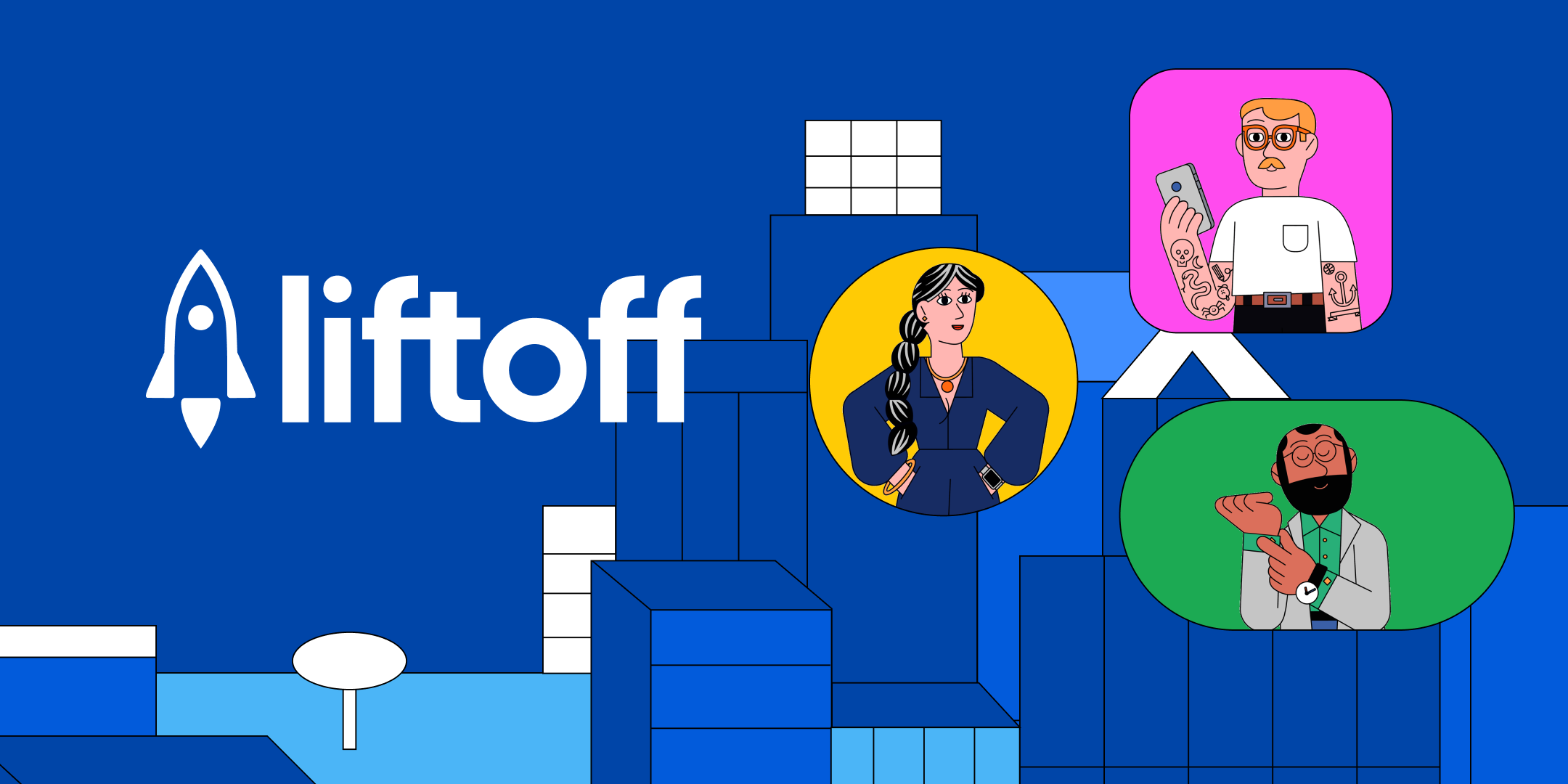
Liftoff.io site redesign
R/GA
Liftoff is a platform that helps people drive traffic and retain users to their mobile apps. They see hundreds of potential clients coming to them with business inquiries.
One of their main problems was they wanted to attract users that were better equipped with knowledge of the Liftoff platform.
Defining the website redesign
Context
Liftoff is a platform that helps people drive traffic and retain users to their mobile apps. They see hundreds of potential clients coming to them with business inquiries. The clients wanted to position Liftoff as a talent leader and a knowledge hub.
While I give an overview of how I worked with a great team of UX’ers to make user journeys, site maps, and wireframes, I want to focus on the resource library work as I claimed ownership of that feature.
Defining our design pillars
At the beginning of any project it's important to align on the higher level goals for this work.
It was important for the client to prioritize users that had insight into how Liftoff could assist them.
The team wanted to look at the existing site architecture to make sure it supported this new goal.
Liftoff wanted to shift their image to being a platform for thought leadership. The redesign should support this.
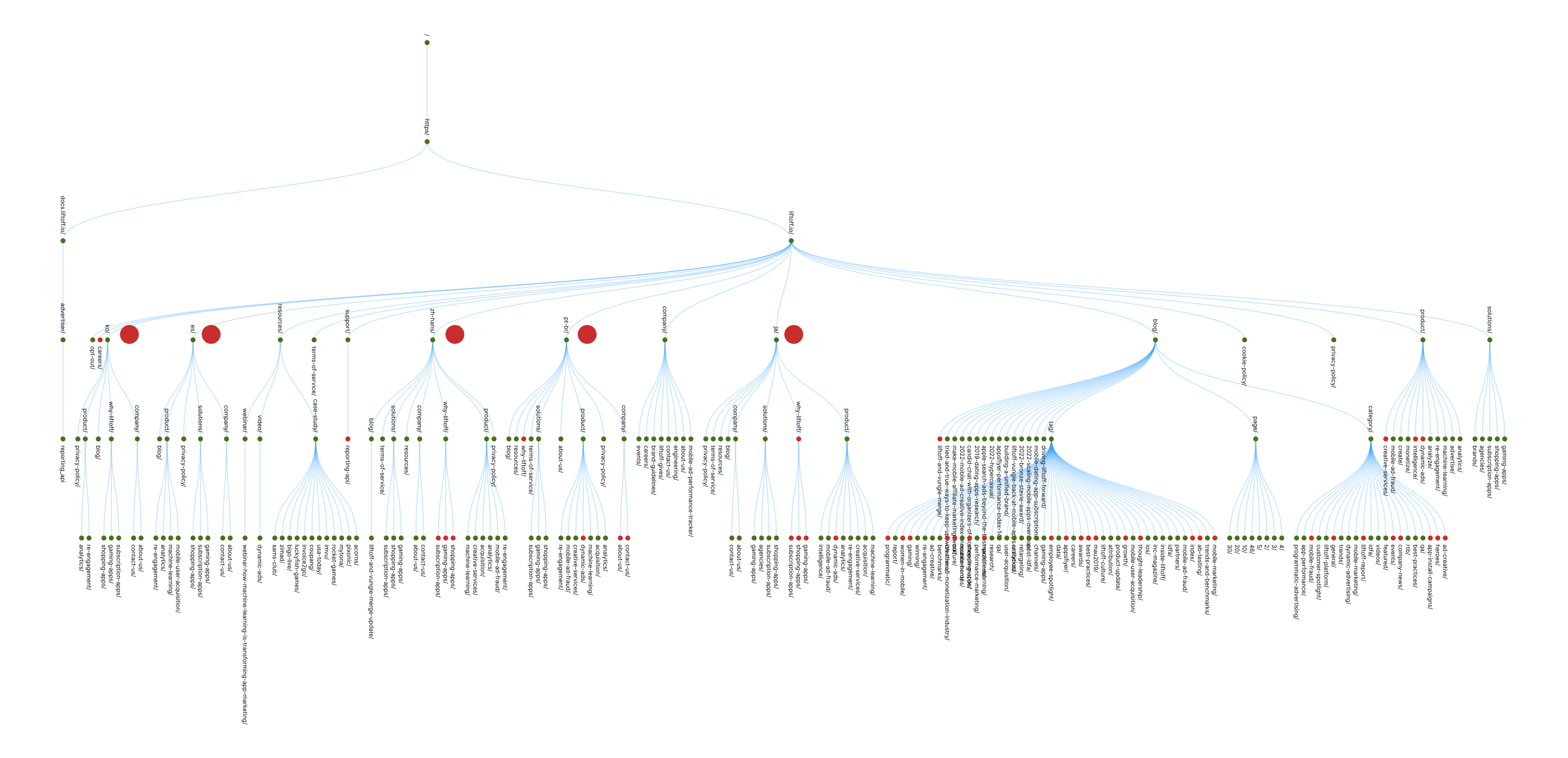
Organizing the existing content
Designing for personas
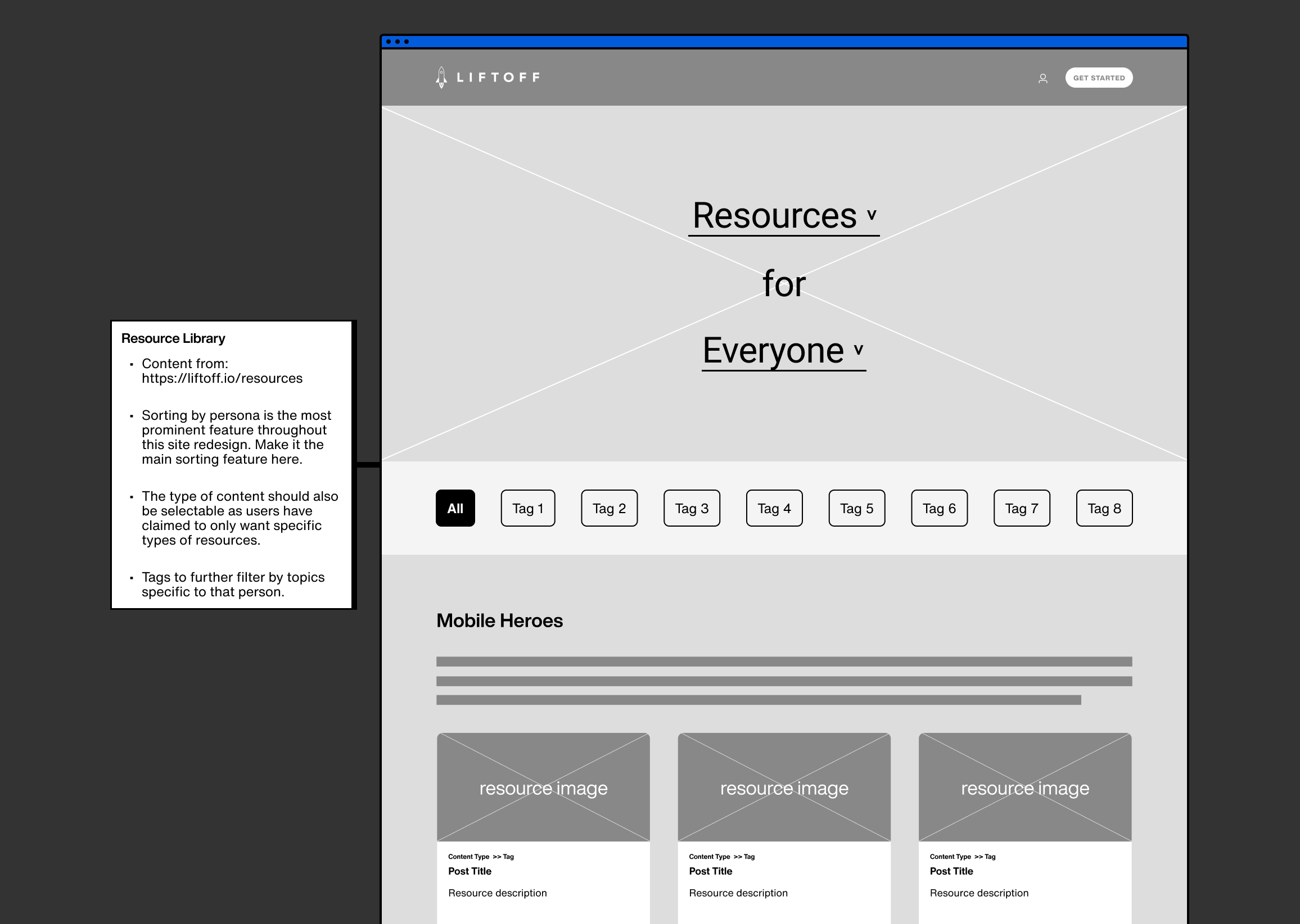
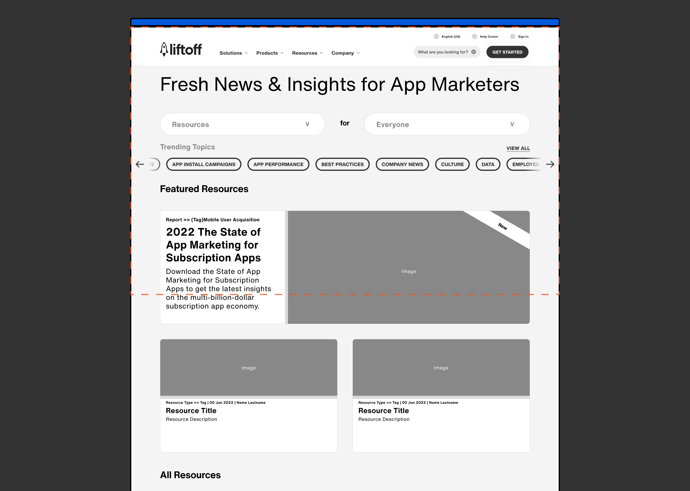
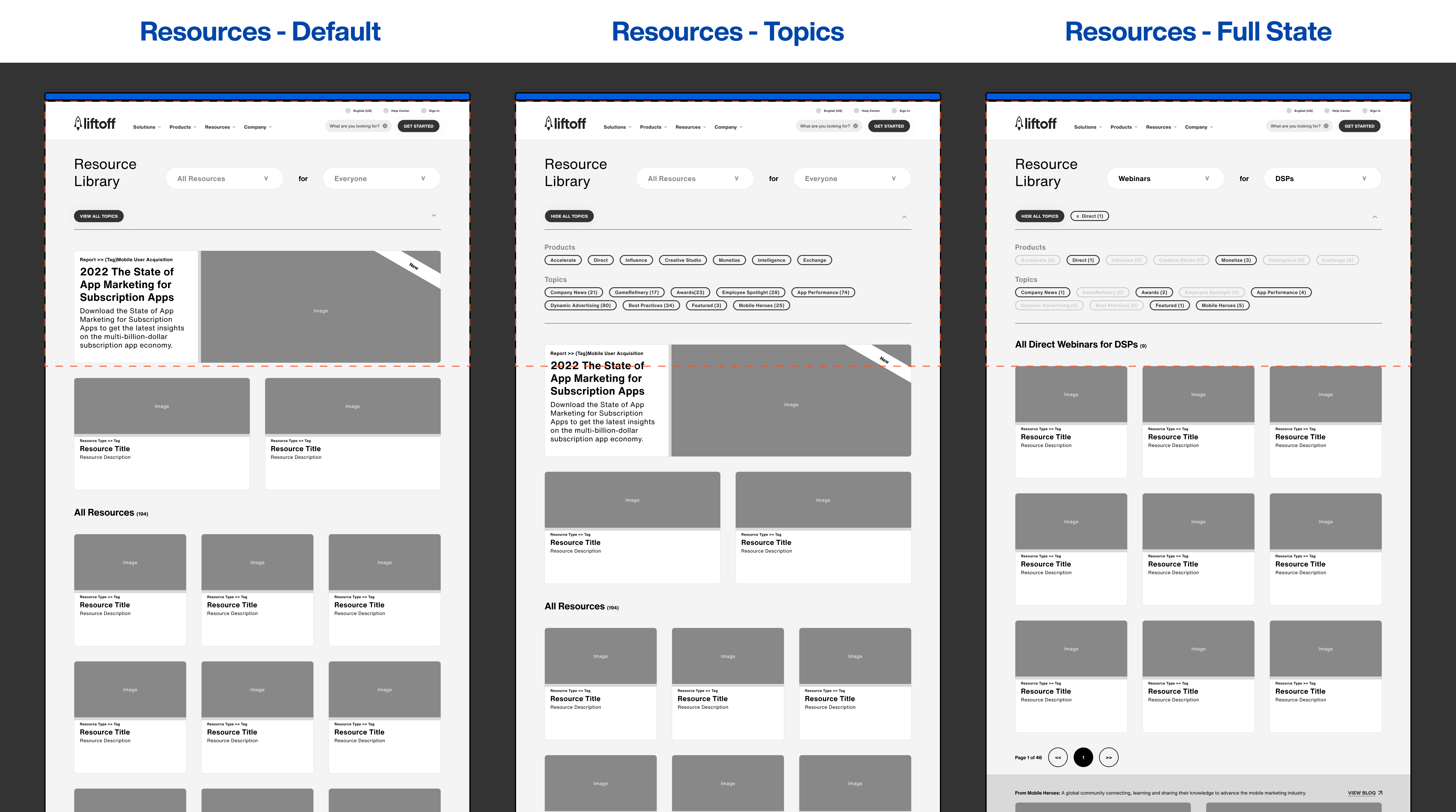
Liftoff loved the idea of creating user archetypes that fit their primary user bases. We had the idea to organize Liftoff’s new site and huge resource library through these filters so users get quick access to content that was useful to their needs. To begin with this organization exercise, we had to figure out how their content was structured already.
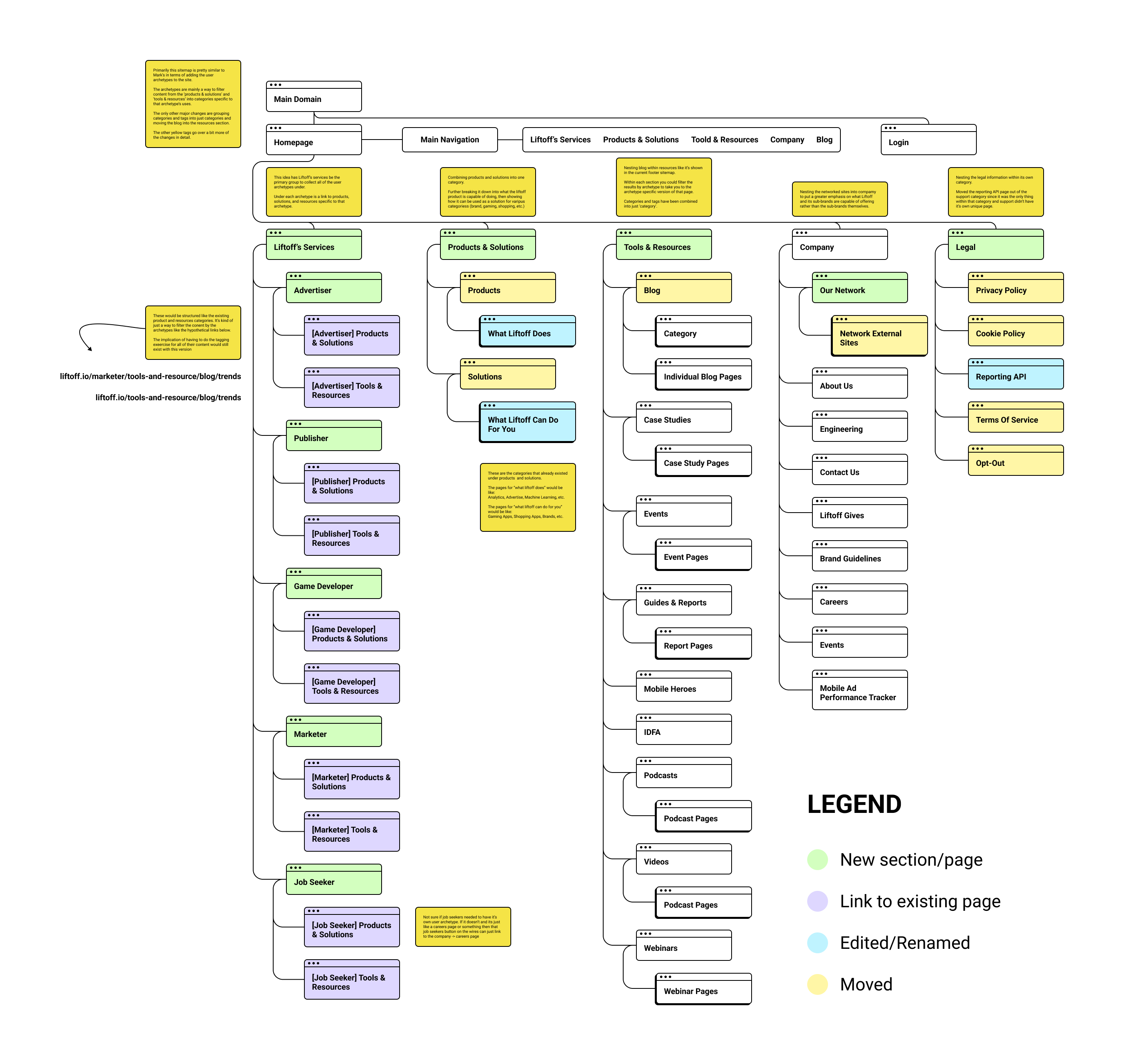
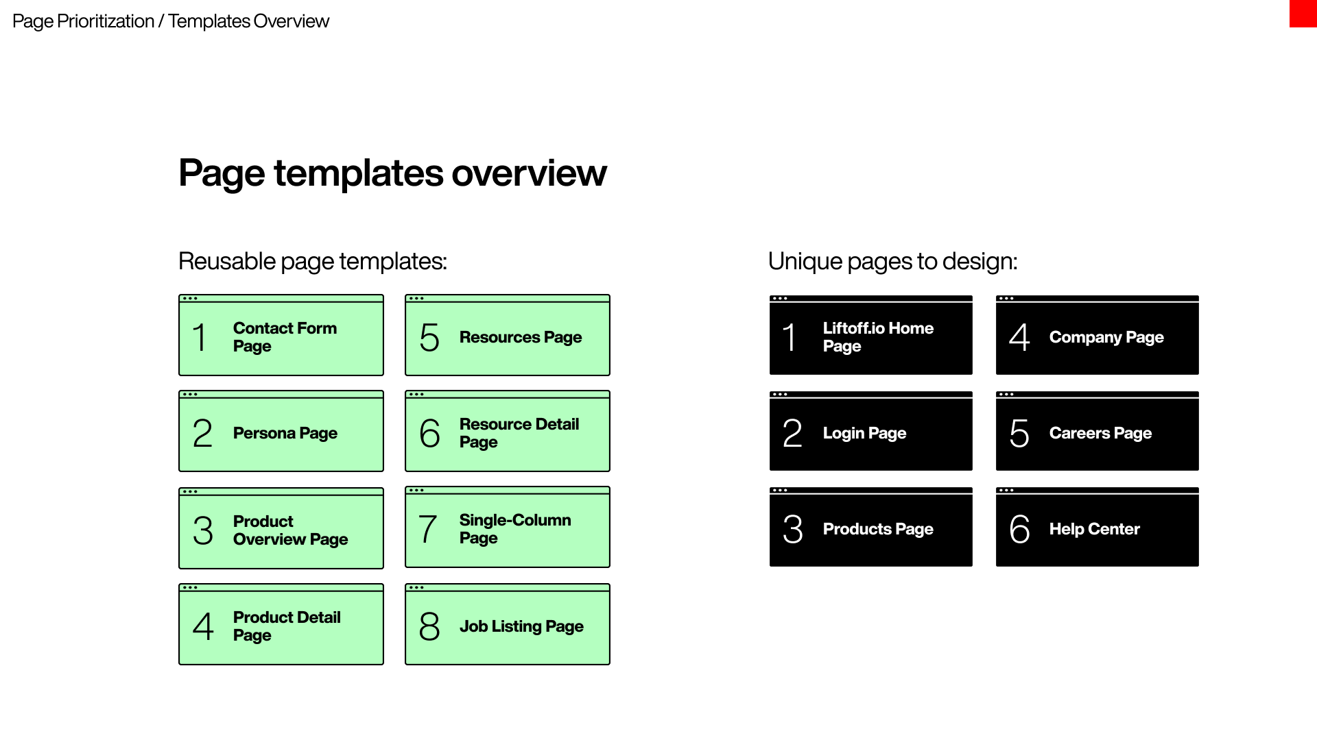
Creating webpage templates
With the archetypes defined, we created templates for the new site page designs. These allowed us to create a modular design system with clear functions.
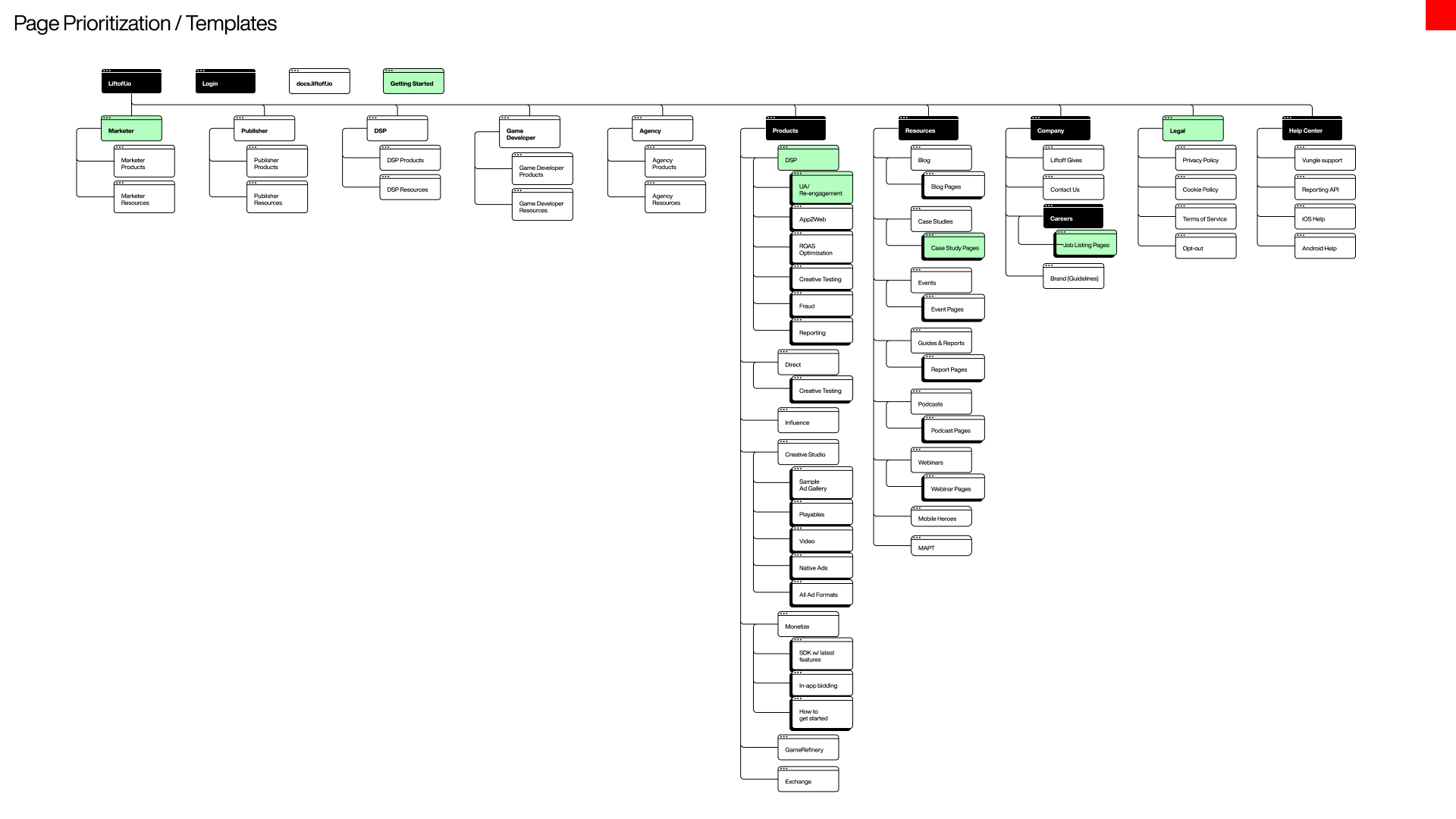
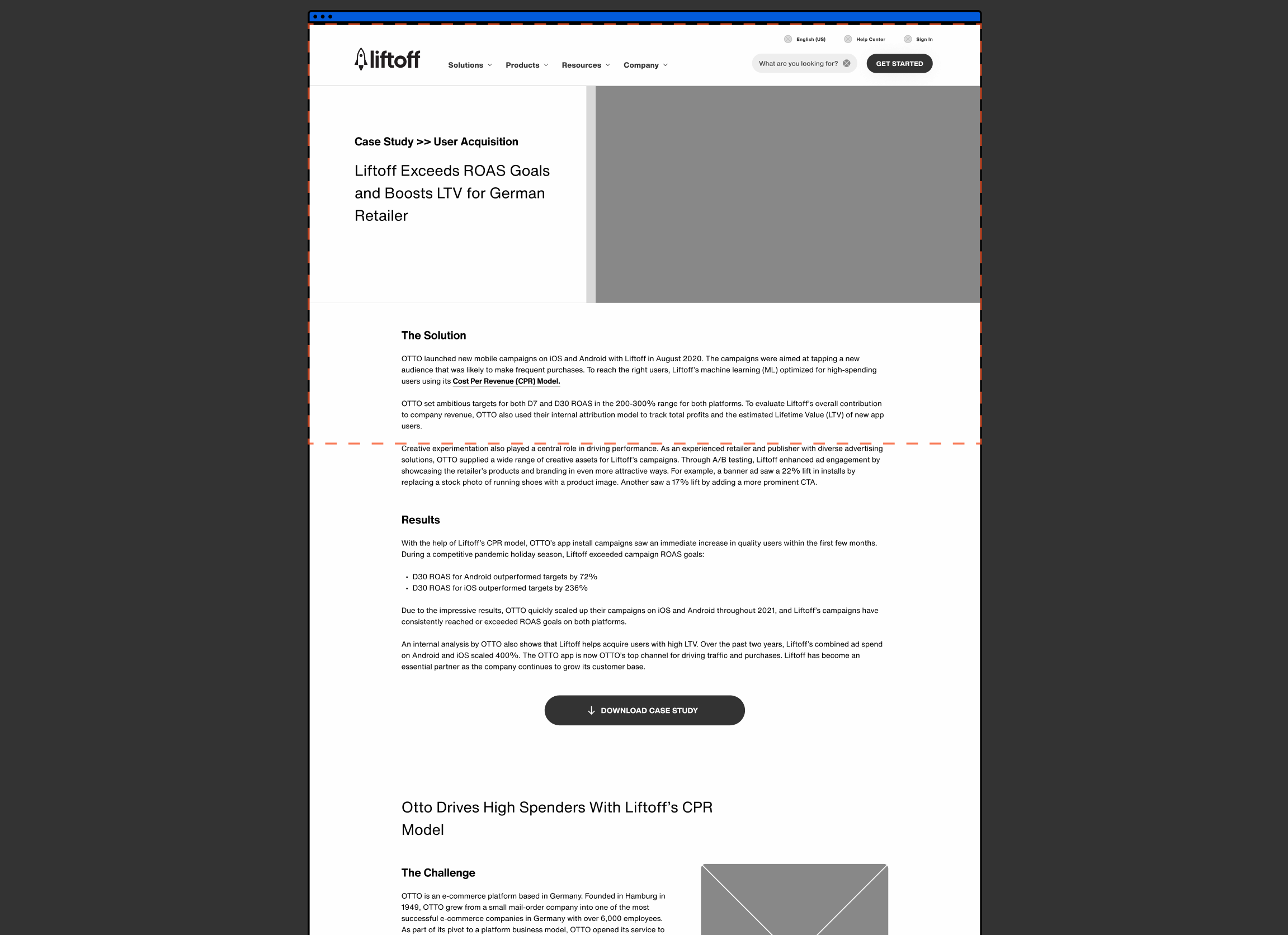
Designing the pages
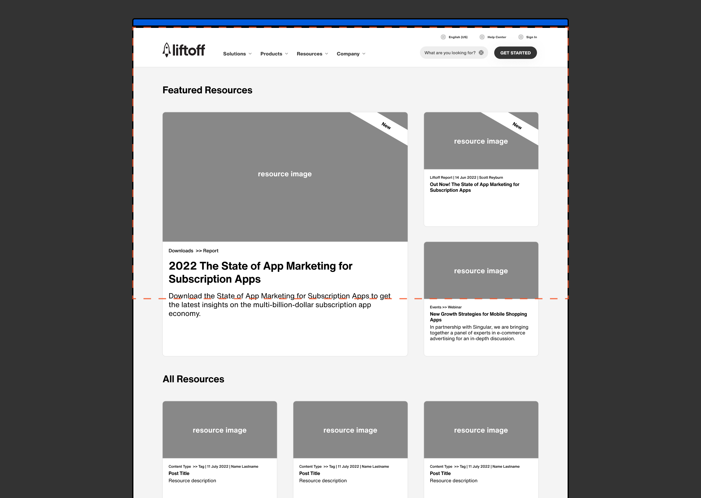
Developing the resource library
I owned the resource library end-to-end: from the initial IA audit through wireframing, iteration across 3 sprints, and handoff to engineering. It was one of the most complex experiences on the site, and the one I'm most proud of.

Working in sprints
We set out to design all of the templates in 3 big sprints. Earlier sprints would focus on more complex, unique pages, and later ones would be more modular templates.
Working with other teams
Designing collaboratively
To improve our documentation process, I set up a Figma workstream that allowed us to create separate components quickly. This approach also let us approach the creation of all the pages systematically after we built the component library, leading to a smoother workflow. It also helped the visual design team monitor our progress.
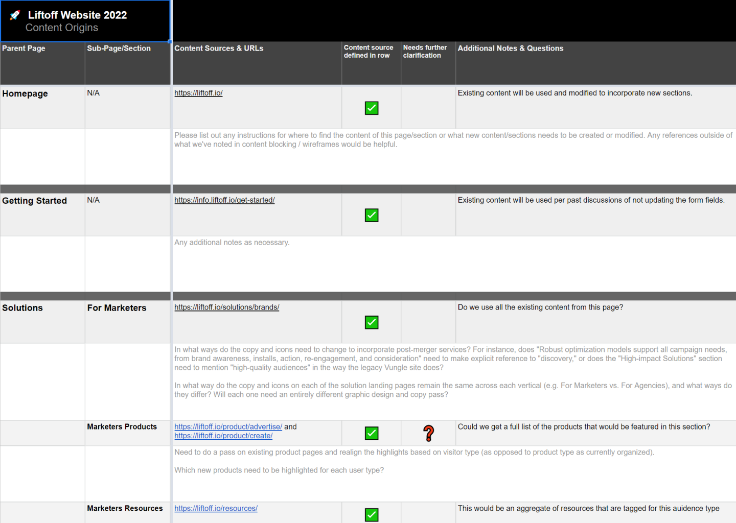
Sourcing content
Sourcing the content for the resource library and other pages while still designing would prove a challenge. We pushed for a content sourcing and tagging exercise to ensure all the content was correctly marked with the new tags.
This meant working in parallel with the engineers from the get-go to ensure they had time to set up their pipeline for this and help tackle some of that work for us.
Iterating on the designs
The resource library saw plenty of revisions during all 3 sprints. It took us a couple of tries to land on defined features for the page that remained true to the initial design pillars, but I’m thrilled with what we created in the end!
Reflecting on Liftoff
In summary
Overall, I’m pleased with the final product we delivered. There were a few hiccups regarding how we would collect all these pages in a way that everyone could work from. Regardless, we did a great job of reacting quickly to new client asks and organizational bumps.
I’m super happy to say this site is fully launched! I’m happy with the functionality of the resource library. This page was a constant back and forth, and I kept coming back to make changes across all 3 sprints. I’m pretty glad the final design stayed true to the wires I created! Going forward, this project taught me much about communicating across teams.
This project sharpened my ability to drive alignment across XD, visual design, engineering, and clients simultaneously. It also proved I can own a complex feature independently within a large team. The resource library is live and fully functional. Ask me about the decisions I made and the ones I pushed back on.
Let's talk some more
I'd love to walk you through my process and talk through decisions. If something in this case study caught your eye, I'd love to chat.