The Sims 4 fan UI redesign
Solo project
The Sims 4 in-game store is hard to browse and doesn't reflect how players actually think about packs. I redesigned it to make discovery the core experience.
Rethinking the player's flow
Context
Designing for Sims 4 players
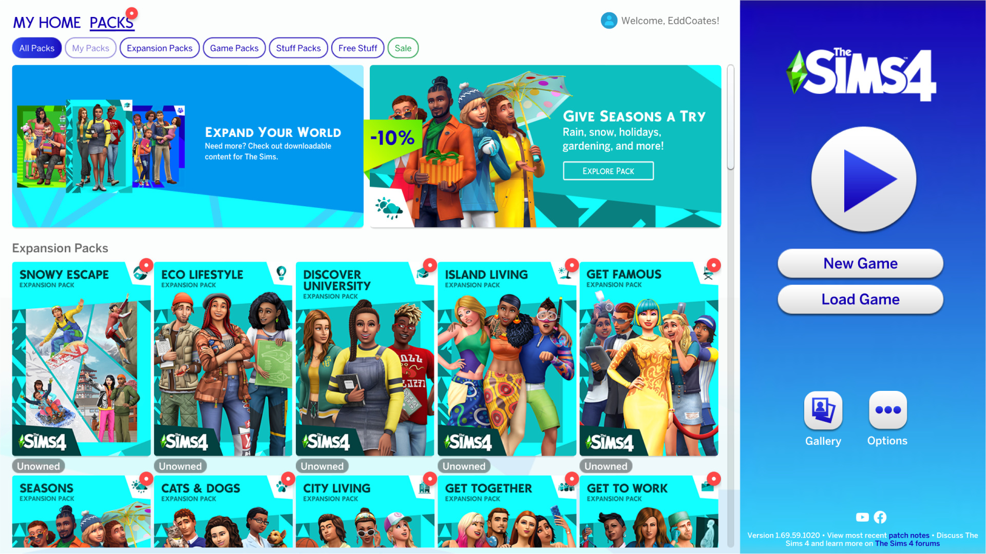
While playing The Sims 4, players can explore all the ‘pack’ options the game has to offer. Players can view these content packs to see and purchase all the content they offer.
I tasked myself with finding creative ways to implement new features for The Sims 4 in-game store flow over the course of a couple of weeks. It'd be good practice to work within a game I love and try to imagine some new features while redesigning the UI's layout.
Innovating on existing designs
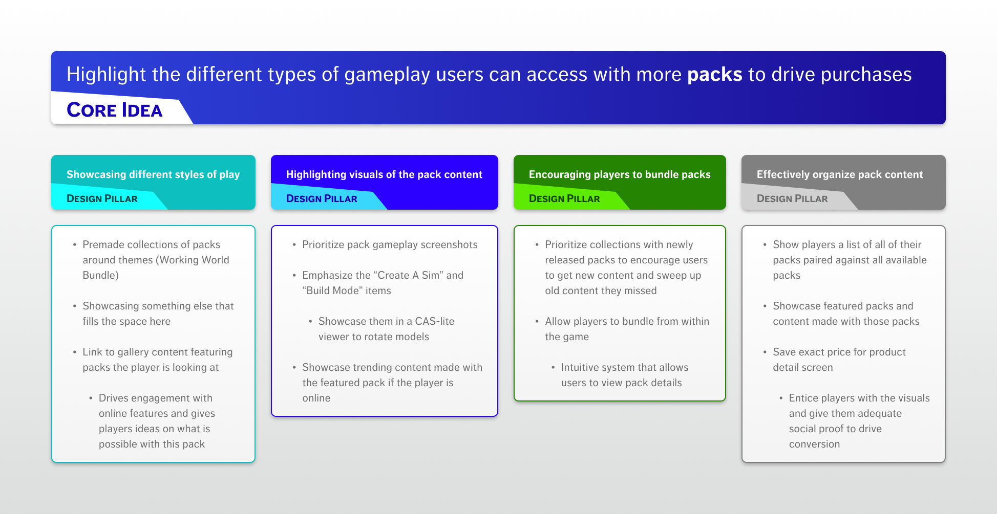
Finding the core loop & supporting design pillars
I identified that the current designs did not emphasize an aspect of these ‘packs’ that players in the community enjoy: multi-pack storytelling. With this in mind, I redefined the core design goal to cater to that and have every aspect of the design support this idea.
Core-pillars-features mapping
I love beginning ideation with a concept map called a core-pillars-features map. It helps keep all new ideas aligned with the core user need/goal/action.
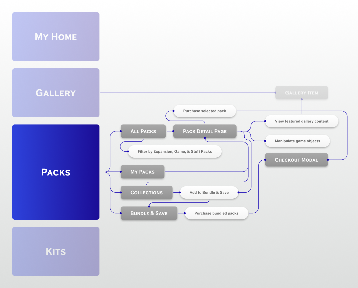
Customer journey & flow
From here, I could break out the experience flow into a sitemap. This would show how all the existing and new pages would sit next to each other, and the primary actions users could perform on them.
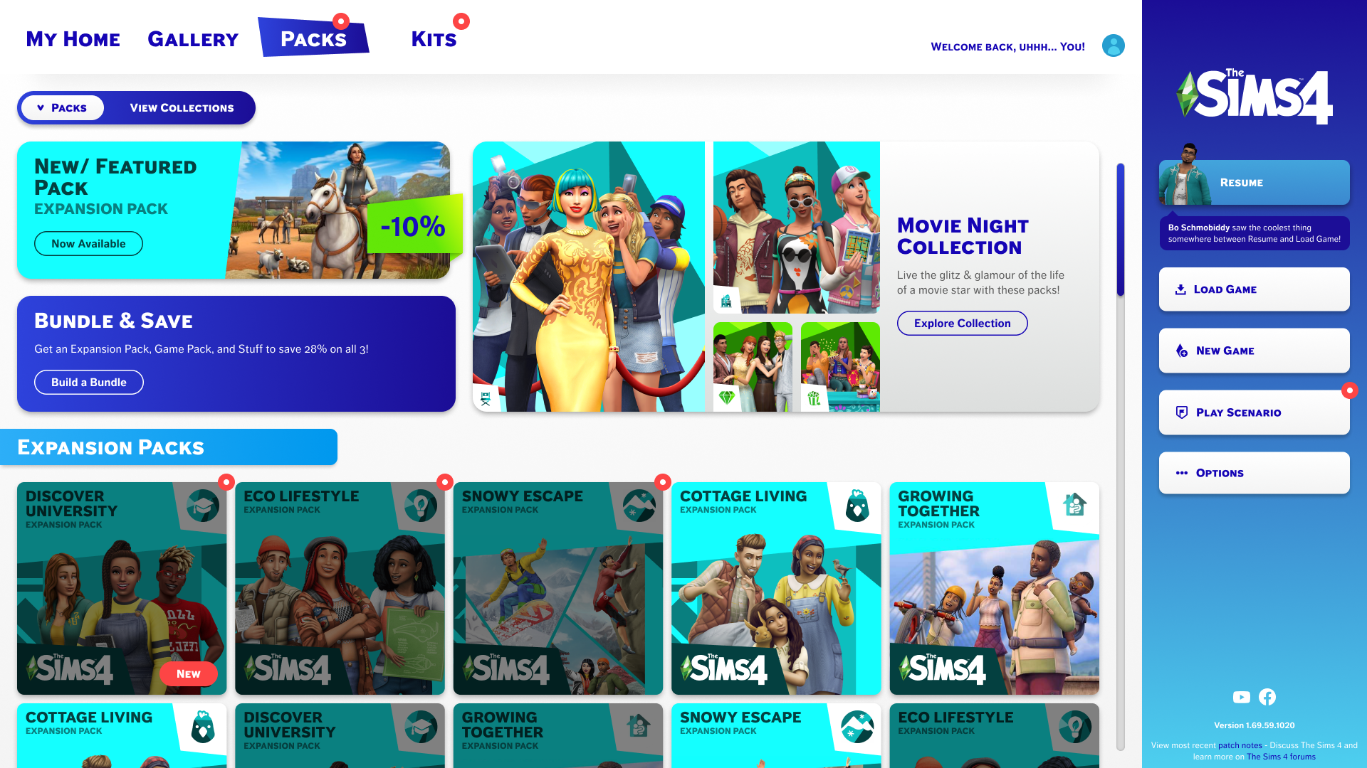
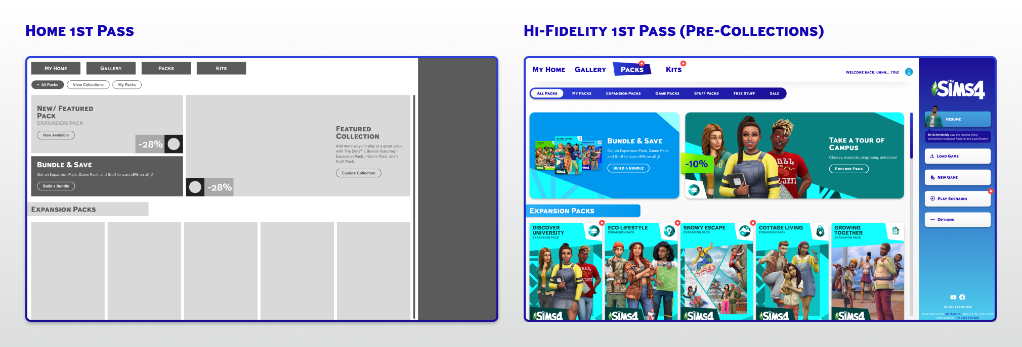
Redesigning the 'packs' home page
Organizing the content
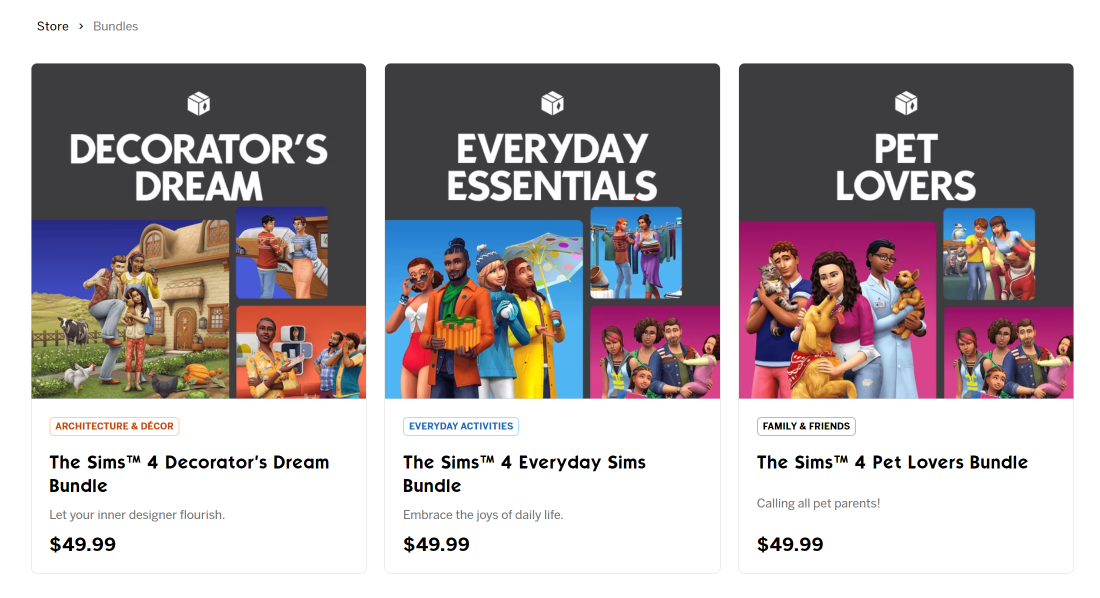
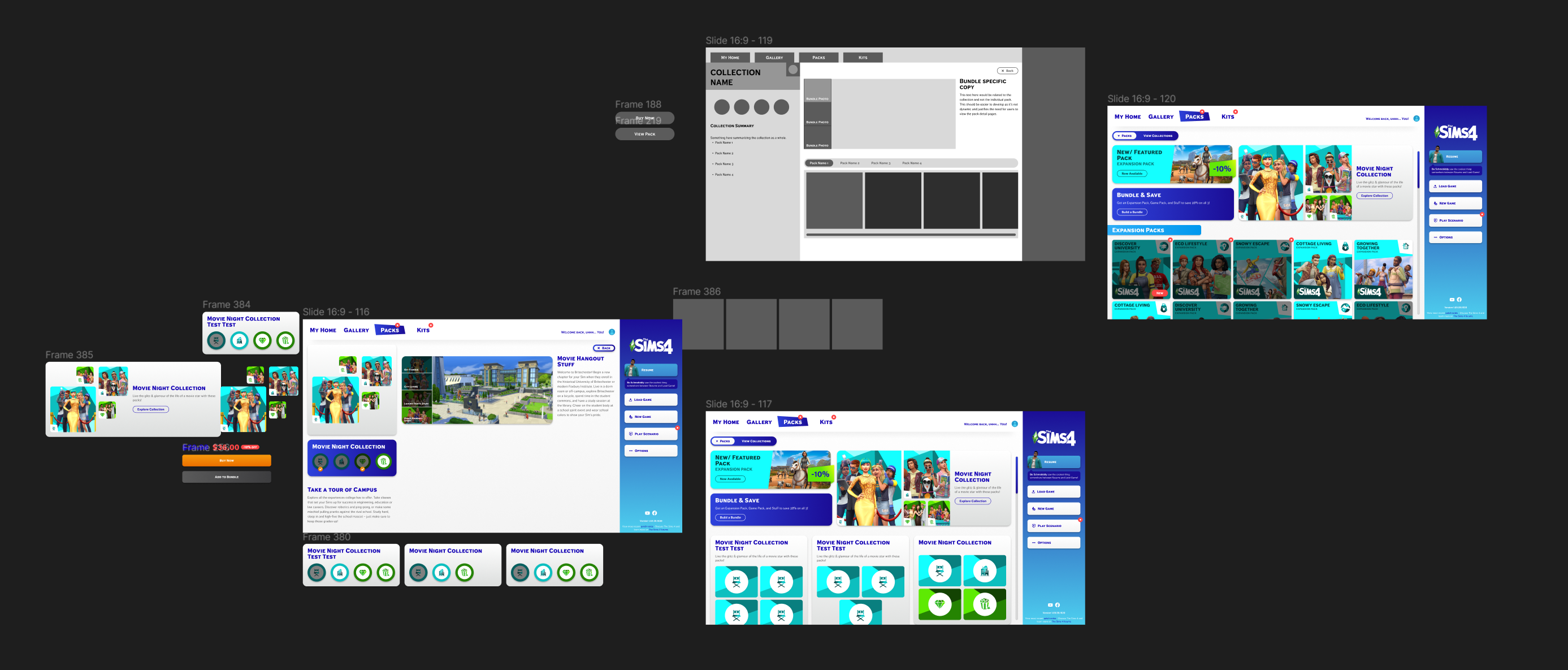
Creating ‘collections’
The core redesign challenge was helping players discover packs they didn't know they needed. I introduced a 'collections' concept, which are curated groupings of thematically linked packs, to make multi-pack storytelling the centerpiece of the browsing experience.
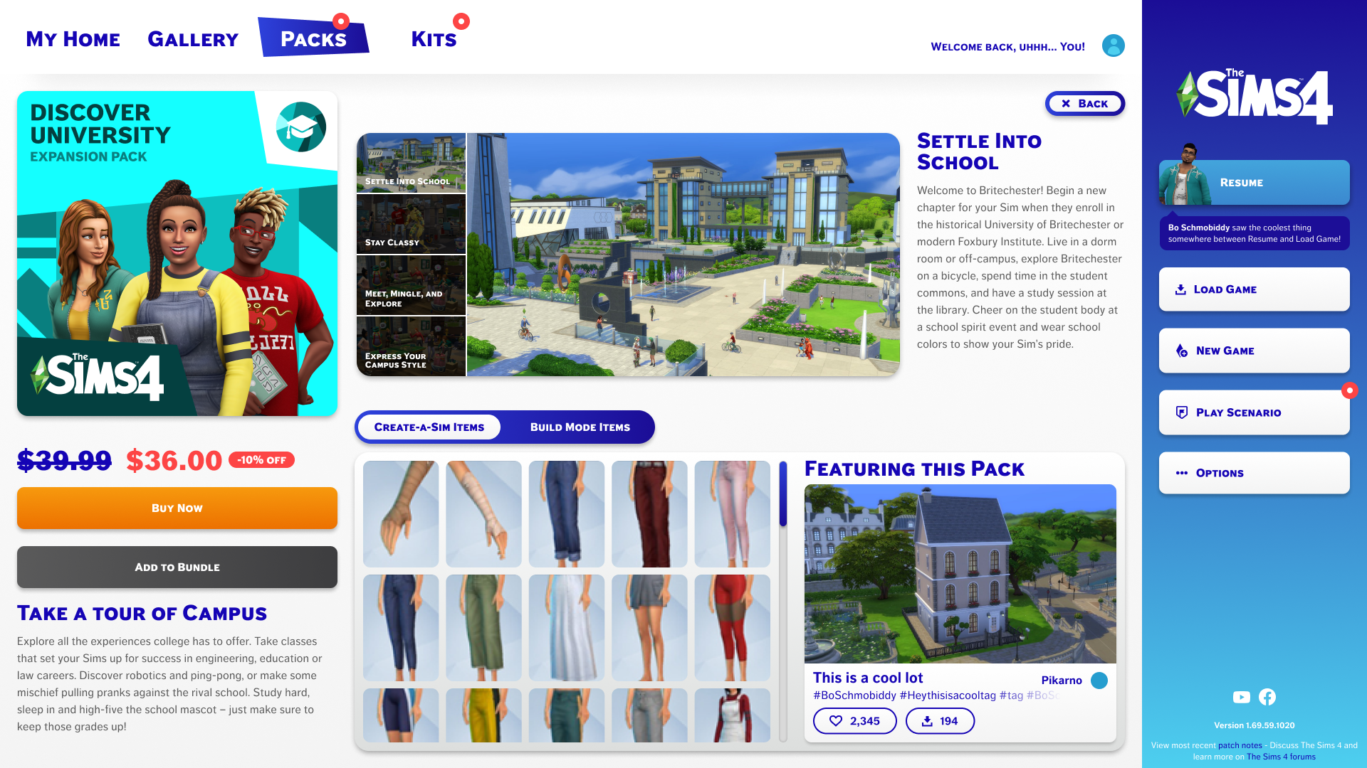
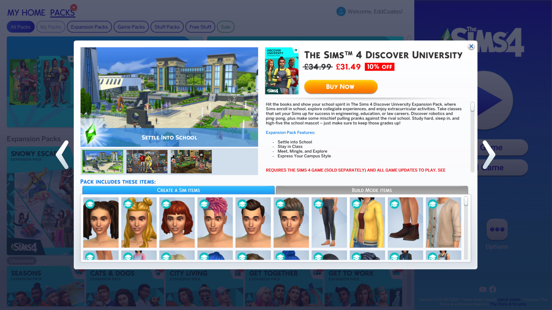
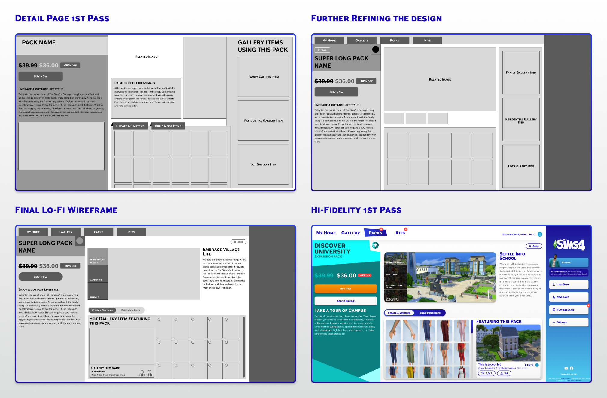
Redesigning the pack detail page
Organizing the content
Adding more content
I wanted to emphasize the added simulation aspects of each pack on this page. I brought in the existing content from places like the EA store and the EA website to showcase how owning this specific pack would enhance your gameplay experience.
I also wanted to leverage the fantastic Sims 4 community here and showcase a community element that primarily features items in the selected pack. This would help players get tangible ideas of what they could do with this pack on the same screen to complete their purchase.
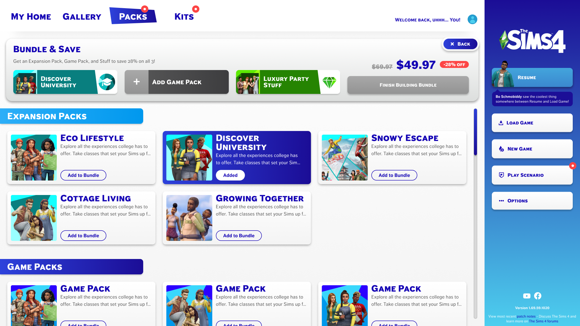
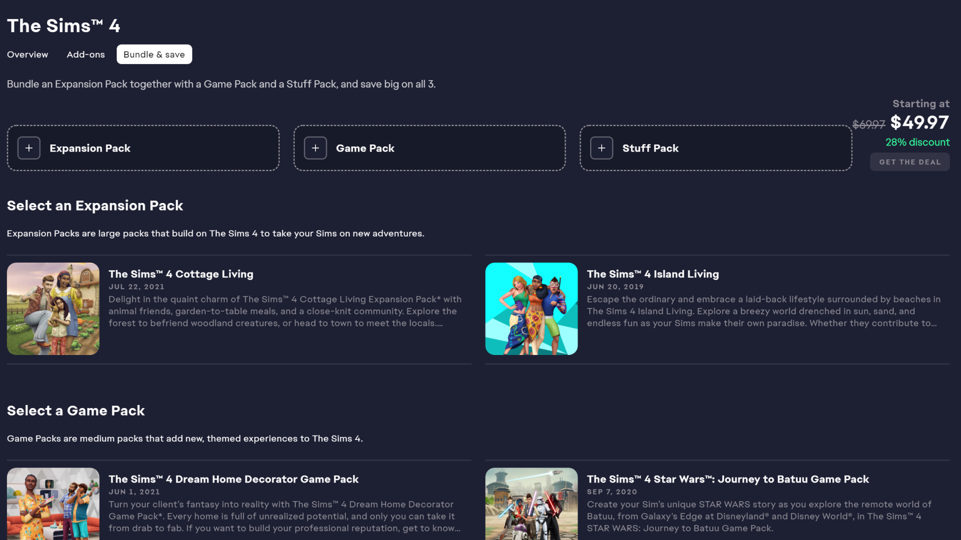
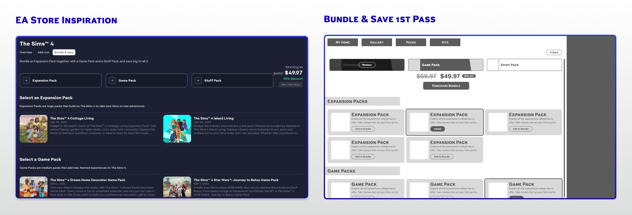
Creating the bundle & save page
Developing the resource library
Defining this page
I thought it would be nice to have the bundling feature built into the game experience. The main goal was to take notes from the EA app experience and translate them to my redesign system. This way, players would have a familiar framework to use when seeing this content in-game.
Reflecting on this project
Going forward
Building on this project
I would love to continue this project by further building the collection pages and finalizing the ‘packs’ flow. I’ve been designing them and only have some rough designs for now, but I’d love to share them anyway!
Taking this to the other areas I greyed out in the player flow could also be fun.
Learnings
Designing within an existing IP taught me to balance creative ambition with brand fidelity. The biggest challenge was making new features feel native to the Sims 4 universe rather than foreign. I'd love to take this further by running usability tests with real Sims players to validate whether the collection concept resonates the way I intended.
Let's talk some more
I'd love to walk you through my process and talk through decisions. If something in this case study caught your eye, I'd love to chat.